Instant Morse Code:
The "Eli" Method
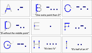
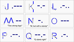
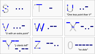
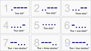
To help myself learn Morse Code, I made these flashcards. The Morse representation of each character is (as much as possible) sketched along the capital letter itself, so that handwriting and muscle memory can assist the learning process. Also included a few soundbites that help me distinguish similar characters. These files are one sided - the other side is just scribbled on with a Sharpie, sorry.
The idea here is that in order to learn morse code, you trace along the letter, following the arrows and blue marks. Go through the alphabet, writing each ~20 times, saying the dits and dahs aloud as you encounter them.
Some of the letters make sense to learn together, rather than in alphabetical order:
- S and O. Everybody knows S.O.S. ... --- ... Pretty easy to remember and a good place to start.
- B and D. These are a natural match, with one extra dit in B matching nicely to the extra dit in the middle of the letter.
- M and N. The N is just an M with a bit lopped off, converting -- into -.
- H and I. Both shaped the same, with the I at .. being half of an H with ....
- Q and Y. Not super evident on the card, but the tail of the Q goes down and to the right, thus --.- On a lowercase y, the tail slants left, thus -.--
- K and X. The K is sideways, the -.- dipping down to that single vertical bar, so one dit. The X -..- dips down to the two feet of the X, so two dits.
- U and V. U is ..- , V is a U with an extra point, so ...-
Bug list:
- I'm not happy with L, the arrangement makes me think of a lowercase i.
- P and R seem difficult, and also backwards (R has one less - than P, it would have been convenient to have been made the other way. <sarcasm>Good job, Samuel.</sarcasm>)
- Non-English extensions are not included. These would be difficult - looks like they were just plopped in wherever there was space left, for the most part they don't seem to line up quite as nicely as these.
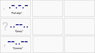
- Likewise, there are some additional punctuation and control characters that I haven't made cards for. (Although, the punctuation doesn't really work with this method anyway)
K sucks.K is great now, and contrasts nicely with X. Long live K!
Version 0.2
Changes in this version - replaced K with one I like better.
Here is a link to the vector file (Inkscape/svg)
Version 0.1
A-I.pngJ-R.png
S-0.png
1-9.png
punc.png
Here is a link to the original vector file (Inkscape/svg), and here is a printable one page image